contact@noncommon.design
Budapest - HU
Târgu-Mureș - RO
Oradea - RO

menu
close
Protena redefined a legacy feed brand for a conservative, price-sensitive agribusiness market. The identity balanced premium perception with accessibility, combining scientific precision and rural trust through a shield-based symbol system, strategic minimalism, and emotionally engaging packaging. A scalable visual ecosystem unified packaging, digital platforms, social media, and retail communication for both corporate partners and backyard farmers. Within six months of launch, the rebrand contributed to a 30% increase in sales and stronger distributor confidence.
Agriculture, Animal feed, Nutrition
Rebranding, Brand Strategy, Naming, Visual Identity, Research, Packaging, Editorial Design
Our creative team was granted full autonomy to build an integrated brand identity, yet the brief felt like "dancing in shackles." We were tasked with replacing a legacy brand (UBM) within a fiercely competitive, price-sensitive, and culturally conservative market. The challenge was to resolve a series of paradoxes:
• Premium yet Accessible: The visual language had to signal "superior quality" without alienating price-conscious farmers who equate "glossy" with "expensive."
• Latin Soul, Regional Reach: The identity needed to resonate with the Romanian market’s Romanic heritage while maintaining a clean, functional appeal for non-Latin neighboring countries. Protena sounds like a natural evolution of the language (Romanian/Latin roots), which builds subconscious trust
• Modernity vs. Tradition: In a market that views "trendy" with suspicion, we had to deliver a look that was undeniably fresh and contemporary, yet felt stable and trustworthy.
• The Hybrid Audience: The brand had to command respect in high-level B2B corporate boardrooms while remaining relatable on the shelves of small, rural village shops.
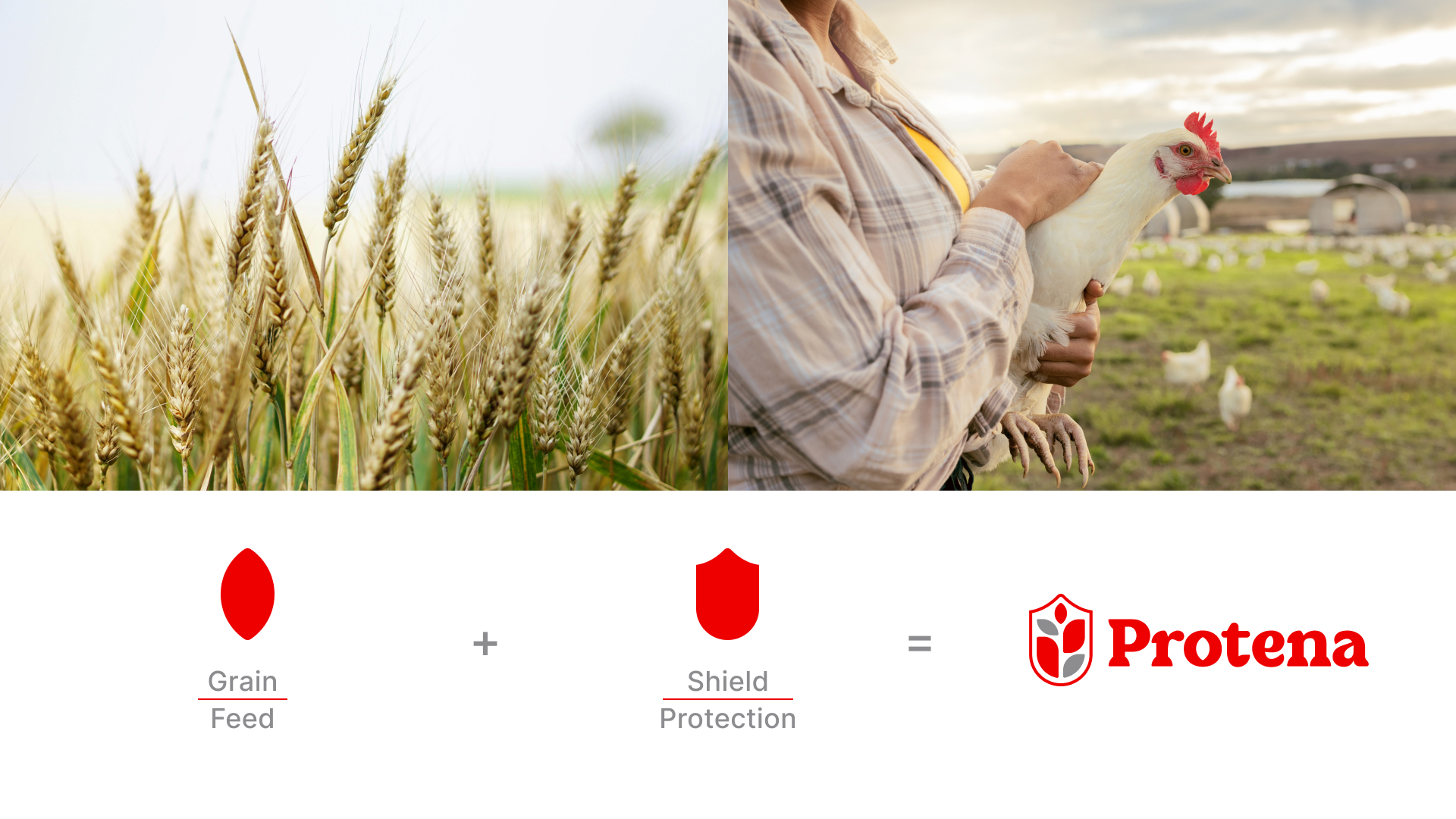
The first step was identifying a name that felt both international and phonetically rooted in the region. Protena was born: a short, punchy name that highlights the primary market differentiator: balanced protein content.
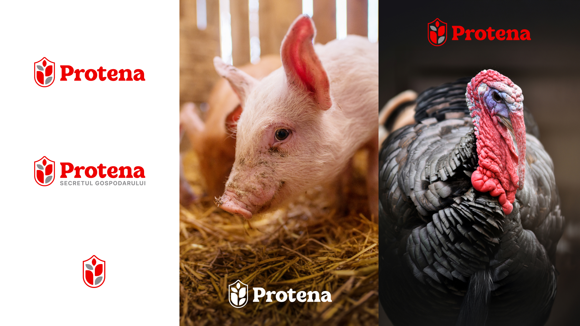
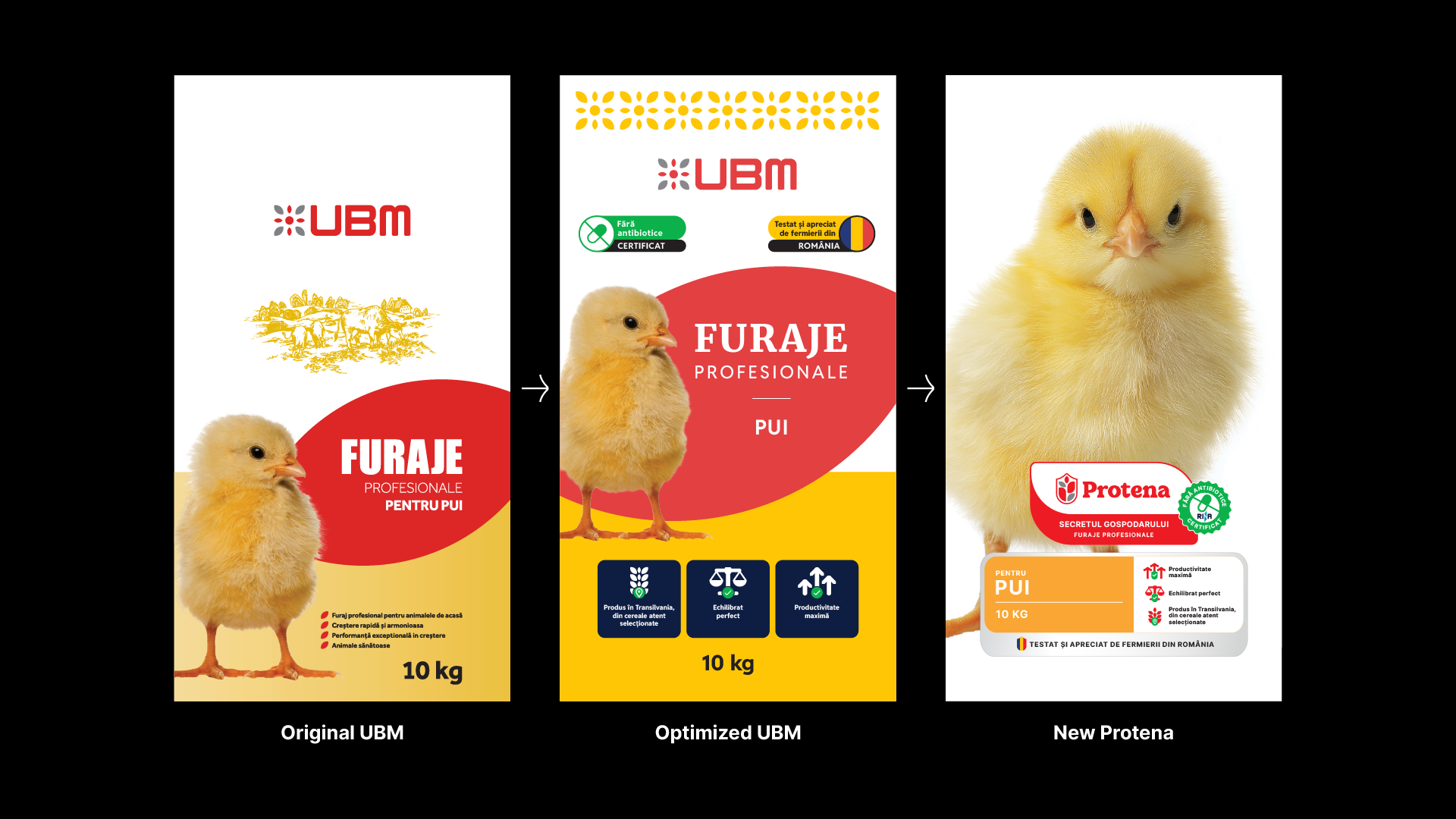
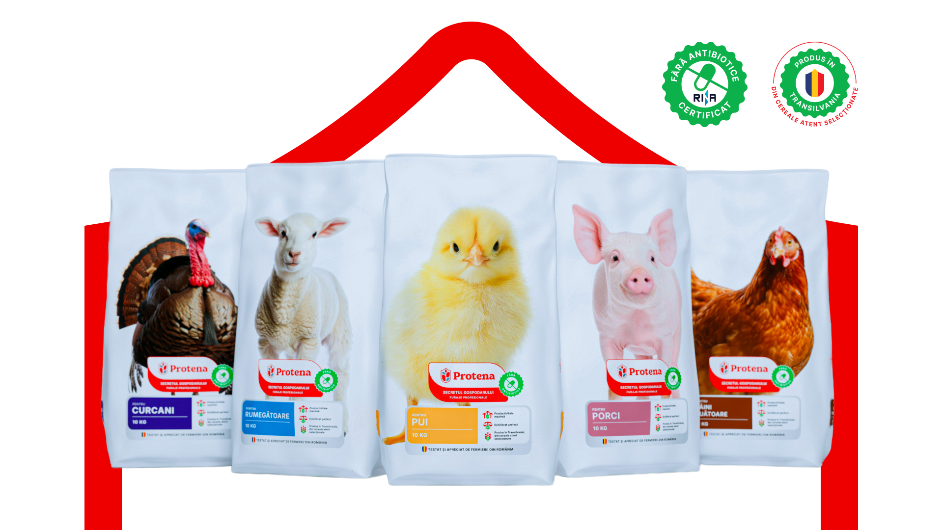
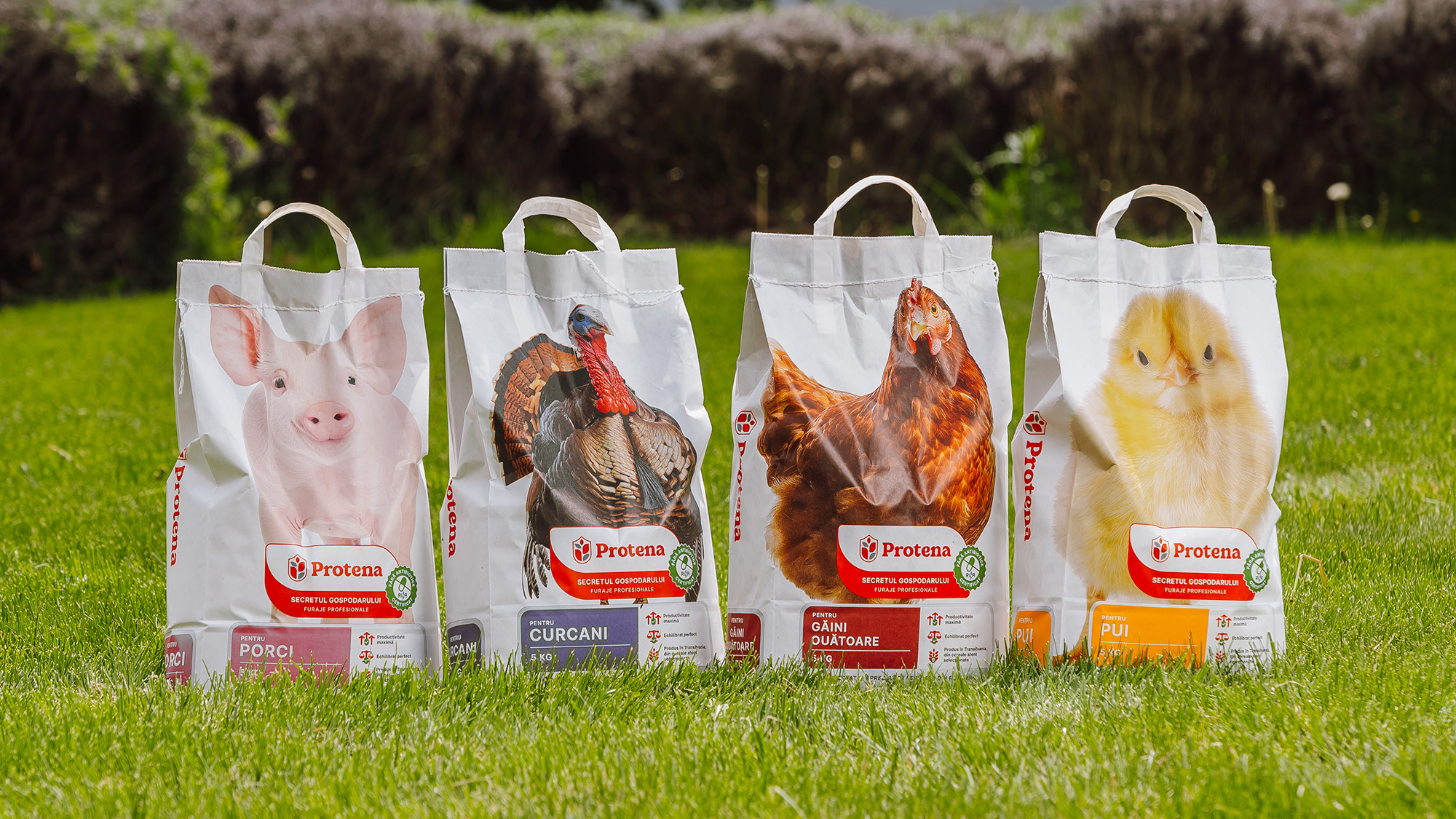
The logo incorporates a shield motif, symbolizing the protection and security that scientific nutrition provides for livestock. We carefully balanced the line-weights to ensure the visual authority of the shield didn't sacrifice approachability.

To ensure Protena stood out in a "loud" and cluttered marketplace, we applied several micro-strategies:
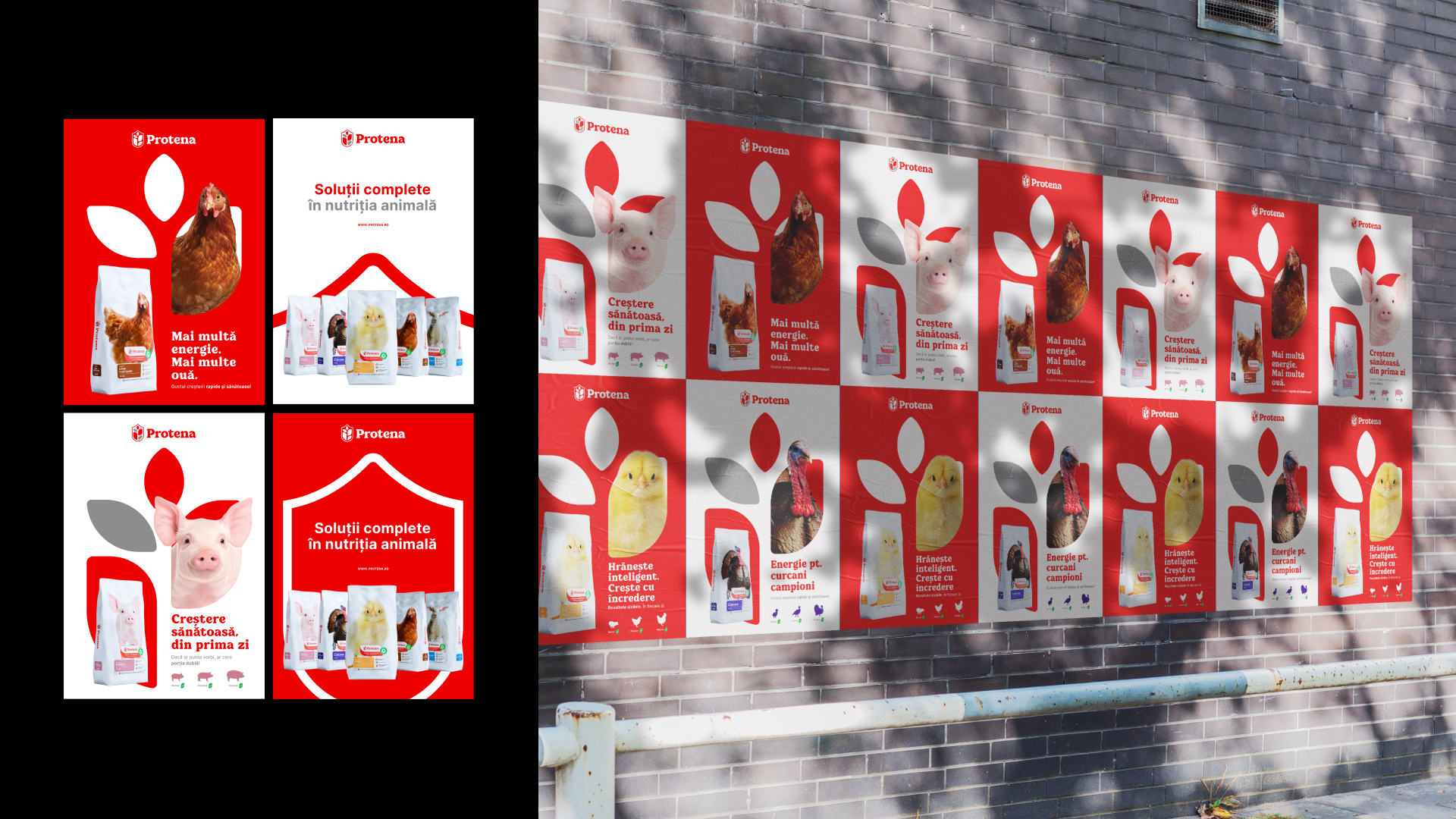
• The Erasure of the Rustic: We deliberately moved away from traditional "rustic" or decorative tropes. By stripping away the visual noise, we signaled that our product is a product of rational science, not just folklore.
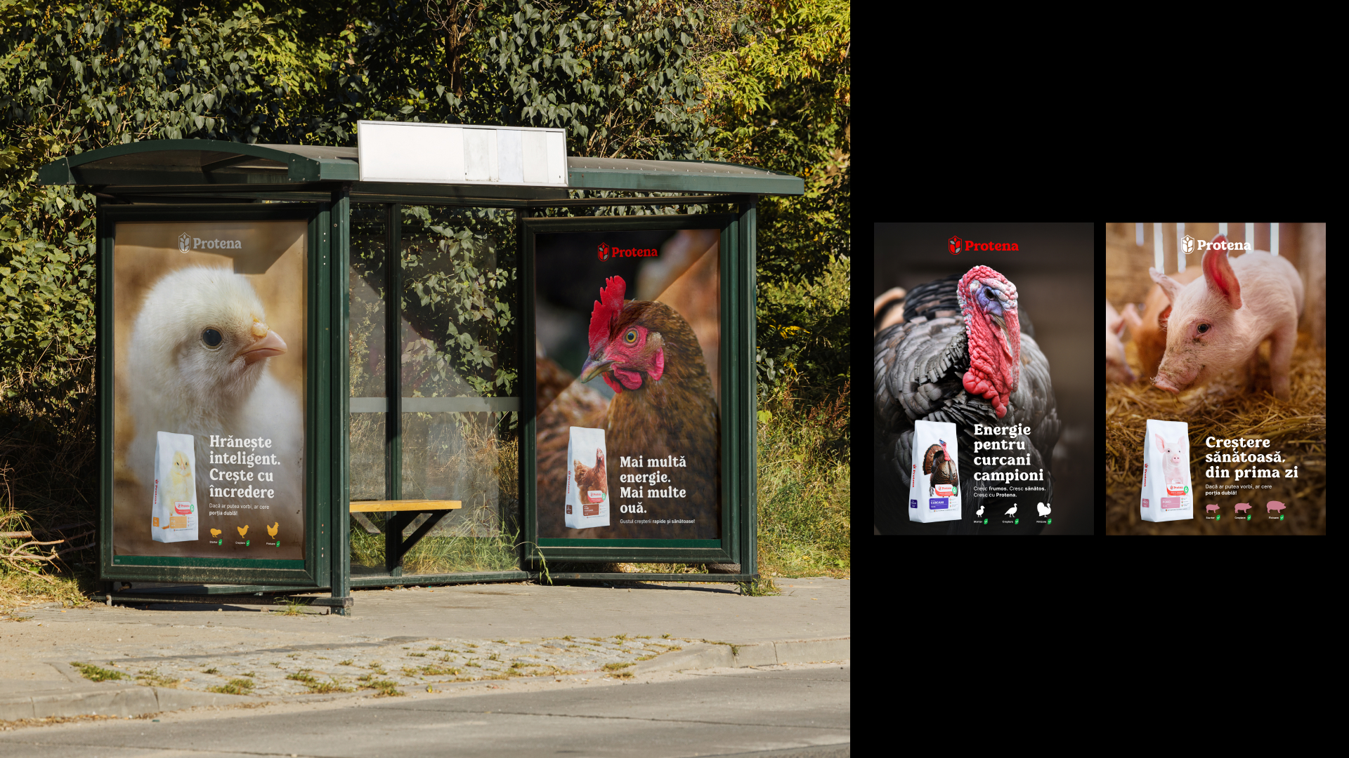
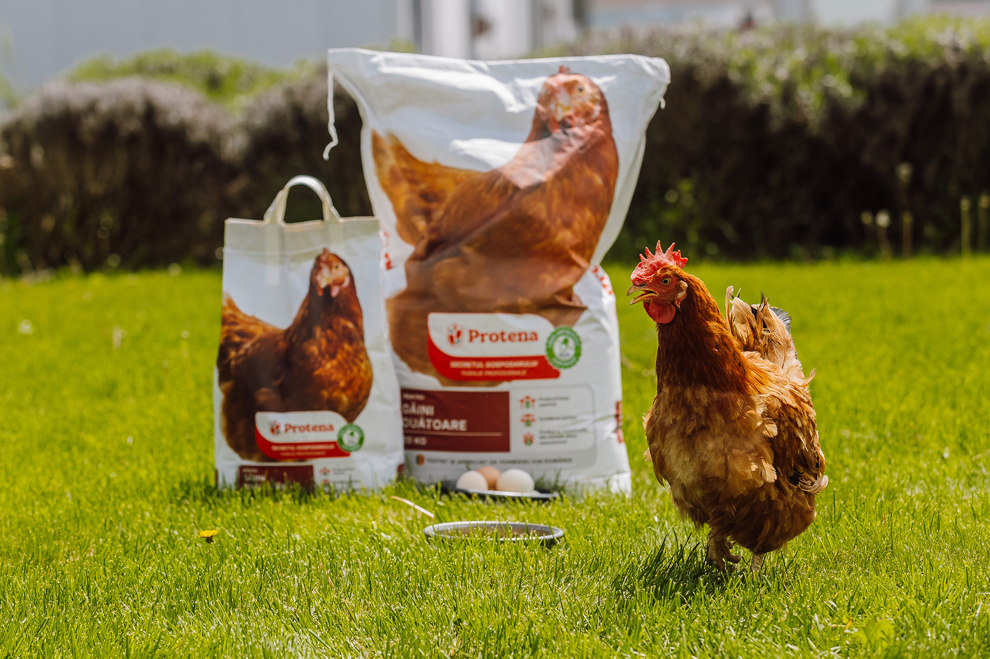
• The Power of the Gaze: On the packaging, we significantly enlarged the animal imagery and adjusted the composition so the animal establishes direct eye contact with the viewer. In the overstimulated context of a rural feed store, this creates an immediate, emotional psychological connection.
• Calculated Minimalism: We followed a "distillation" process-stripping the graphics down to their bare essentials until only the most potent brand elements remained.
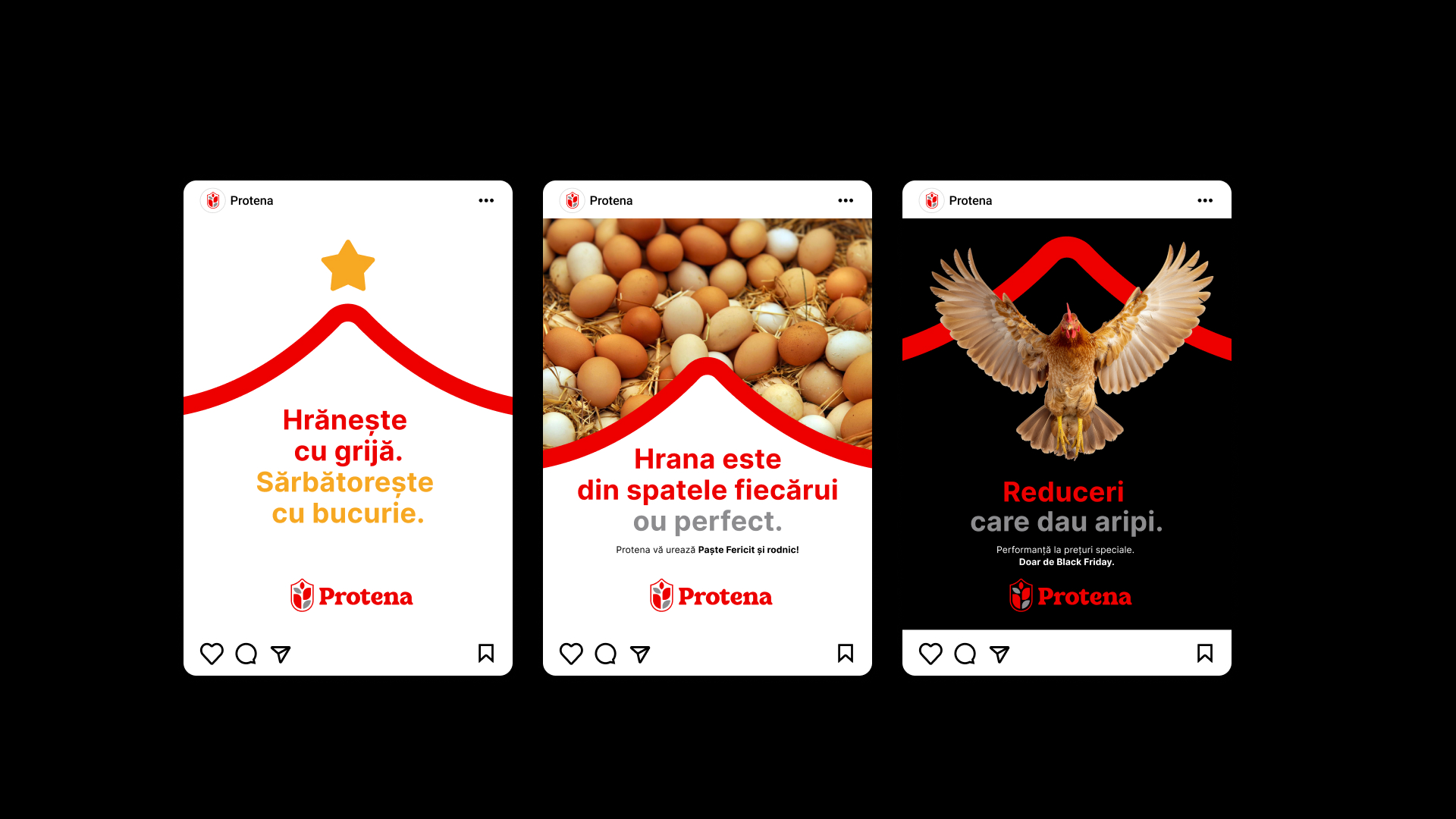


Knowing the brand must live online, we focused on two pillars:
• UX for Two Worlds: A web interface designed to be as intuitive for a backyard farmer as it is informative for a corporate procurement officer.
• Intuitive Social Media Framework: We developed an expansive portfolio of social media templates and a rigorous "Brand Bible." This ensures that any external content agency can remain "on-brand" intuitively, guaranteeing a consistent voice across all digital touchpoints.
The success of Protena is measured not just in aesthetics, but in the bottom line. Only six months after the official launch, the client reported a 30% increase in sales compared to the previous brand’s three-year performance.
Beyond "spontaneous" retail purchases, the new identity has fundamentally shifted distributor behavior. Wholesale partners are now significantly more willing to invest in larger inventories, citing that the "Protena" identity provides the professional confidence required to move volume in a crowded market.


Creative Director: Attila Kelemen
Art Director: Zsolt Kolcsár
Creative Team: János Janó, Péter Gáspár, Tamás Szabó, Zoltán Szőcs
Photography: Bereczky Sándor
